EXTURE AND CONTRAST ANIMATE THIS MODERN HOME
WRITTEN BY RONDA SWANEY / PHOTOGRAPHY BY SHADE DEGGE
Look up the synonyms for neutral and you will find pale, drab, indistinct, colorless. Not one of those words applies to this Corona Del Mar, California home, despite its decidedly straightforward palette. Here, the scheme is bold, vibrant, and even exciting. When Denise Morrison, owner of Denise Morrison Interiors and interiors boutique House of Morrison, approached this project, her goal was to push the envelope of the neutral palette to show just how energized it could be.

Interior designer Denise Morrison toyed with finishing the fireplace brick the same creamy color used outside, but she wanted a wow factor. The charcoal, nearly black color provides a visual anchor in the great room.


Mature olive trees shade an outdoor seating area in the interior courtyard.
Morrison was brought on board by custom-home builder Devco Homes to create the design for this spec house project. Not knowing who the buyer would be influenced Morrison’s design choices. “People have strong opinions about color. Keeping that in mind, I wanted a design that read very neutral but was high contrast so it wasn’t boring,” she says. “With high contrast and high texture, you can easily add in colors through furnishings and fabric while still allowing the bones of the house to appeal to a broad range of people.”
Some people have a narrow view of what neutral entails, limiting it to only light and brownish colors. “They think cream, ivory, beige. To me, neutral includes black, white, and gray. It’s all those colors in between that create interest,” says Morrison. The exterior celebrates these dark to light contrasts. Creamy brick and stone pair with mid-tone wood and dark steel. “It’s hard to mix brick and stone and wood tones if you’re not a trained designer. We kept everything in the same color family and that’s what made it work,” she says.
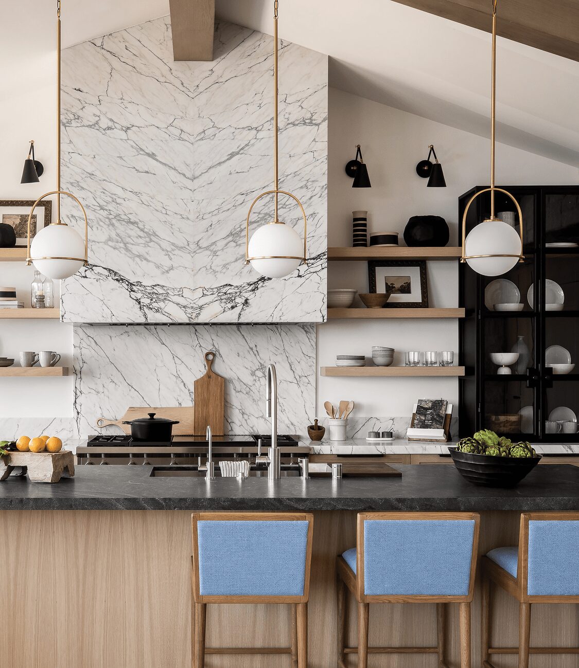
Those same contrasting materials and colors make their way inside, but contrast wasn’t the only tool in Morrison’s arsenal. “We used lots of texture, from the movement in the marble used in the kitchen to the painted brick fireplace in the great room. Texture adds character and it’s definitely not boring,” she says. The mix of textures works well inside and out. The coarse surfaces of brick and stone contrast with the smooth cedar and placid steel that leads to a private courtyard. Mature olive trees planted in the yards give the new build an aged quality and make it feel anchored in time and place. The interior evokes a similar response. It doesn’t have the squeaky sterility that often comes with a just-built home. Morrison describes the style of this home as Napa Modern Farmhouse. “It evokes a serene feel that’s about the earth and very natural. You won’t see many manmade elements in this house. The architecture relies on the surroundings and emerges from there,” she explains.
In the entry, floor-to-ceiling, steel-framed windows and doors welcome the natural light that reflects off the Benjamin Moore Simply White walls found throughout. The cedar ceiling, rift-sawn oak hardwoods, and oaken beams envelope each room in warmth, as do the warm-hued brass fixtures.
Spectacular outside views are welcomed into every room and offer bursts of color that change with the light and the weather. This is perhaps best exemplified in the primary bedroom. Massive windows look onto the harbor, drawing in existing shades: blue water and sky, green trees, and terra-cotta roof tiles. Nothing in the room draws the eye away from the expansive vista. “When you have a view as big as this, you don’t want window coverings to pause your eye. This home is about the beautiful view,” says Morrison.
The feeling that view evokes is the essence of this home. Its purpose is to unite the architecture, inside and out, to the surroundings. “From the minute you walk up to the gate, you know the feeling you’re going to have when you walk in the interior,” says Morrison. “It’s all very connected.”
mix master
Denise Morrison mixes metals, tile styles, and adds subtle color hints to this featured design scheme. Here are her tips for mastering these mixes.
Metal. The kitchen combines stainless-steel, black, and brass fixtures. “If you don’t know what you’re doing, this can look hodgepodge,” she warns. But, she says you can’t go wrong with picking a durable, stainless faucet. “They almost act invisible, but in a good way.” The black light fixtures and hardware add continuity to black and steel accents used elsewhere. Brass adds bling and its warmth mimics the wood tones used throughout. Takeaway: Choose metals that complement colors in the rest of your home.
Tile. The floor is the attention getter in the primary bath. Morrison let that take center stage and chose softer gray slab tile for the shower walls and mosaic for the shower floor. Takeaway: Let one pattern take the lead and choose other tiles that are more subdued.
Color. Morrison added colors drawn from the home’s views. That means sky-blue fabric used on the kitchen island seating and terra-cotta-colored textiles in the primary bedroom. Takeaway: When adding colors to a neutral palette, use restraint and be inspired by your view.


The outside of this home is echoed inside. Creamy but textured stone, black steel, warm woods, and high contrast are themes found throughout.

Deborah Farmer


