
FEARLESS
DARING COLORS DEFINE THIS CALIFORNIA CONDO
THEY OBVIOUSLY ARE NOT AFRAID OF COLOR,†SAYS CORINE MAGGIO ABOUT THE YOUNG COUPLE WHO OWNS THIS CONDO IN SAN DIEGO’S EAST VILLAGE. MAGGIO, OWNER OF CM NATURAL DESIGNS, ISN’T AFRAID OF IT EITHER AND WELCOMED THE CHANCE TO GO BOLD IN THIS HOME’S DESIGN.
When Maggio came to the project, the space was dated and uninspired. The well-traveled owners wanted to incorporate pieces gathered on their travels and to reflect style notes from some of the boutique hotels they’d enjoyed. The home needed cosmetic fixes and ways to define space in such a large and open area. The roughly 1,500-square-foot space is open plan and its two bathrooms are the only closed off rooms. Maggio’s firm presented a style study to the couple for the home. “They said, ‘We want you to go all the way,’†says Maggio. But, she notes, “There are clients who say that and there are clients who mean that. These clients meant it.â€
Maggio says, “People often want something that looks like what their neighbors or friends have. It’s exciting for us when we have clients with a unique vision and the confidence to move forward with it. This couple was for sure that type of client.†Their existing furniture gave Maggio clues to their design aesthetic. She chose a saturated blue found in the couple’s dining chairs and used that shade on a large built-in and on high wainscoting installed in other parts of the space. The built-in holds books and items collected on their travels. The color causes their collection to stand out more than it would against a more neutral shade. The same is true for the blue wainscoting. The higher than typical wainscoting and its color allow art from a favorite photographer to become a focal point in the space. “That color enhanced the photography and made it sing more than it would have on a blank white wall,†says Maggio.
The blue of the built-in is drawn into the master bedroom via mirrored cabinets that help define the space. The mirrors also reflect the fuchsia drapes that lend privacy.
Black, white, and gray dominate in both bathrooms, providing the spa-like feel of a high-end hotel, while the audacious use of green warms both spaces. In the guest bath, the green appears in vivid wallpaper placed above black wainscoting. In the master bath, a green moss wall prevents the space from feeling sterile. Back lighting behind the moss offers a soothing backdrop for the deep, soak-in tub with a mirror-like finish.
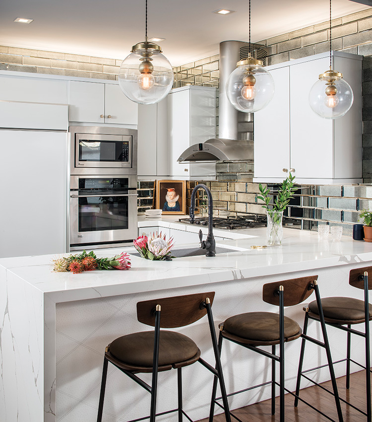
Another mirrored finish finds its way into the kitchen via a beveled, subway-tile backsplash. This inspiration came from a bar in a hotel the couple enjoyed. Glossy cabinets add to the shine, as does the veined quartz countertop that waterfalls over the edge of the peninsula. That same peninsula is covered in patterned vinyl that adds a subtle high-end touch.
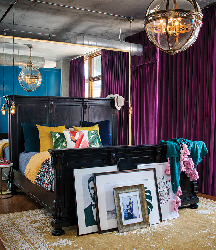
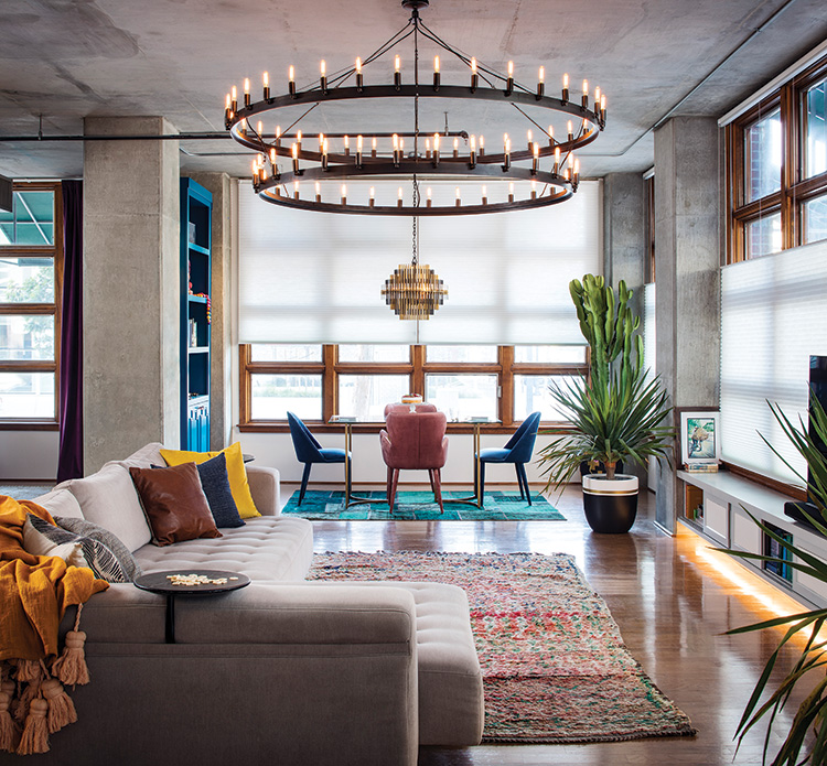
Color helps define each room, as does lighting. This condo is on the ground floor near the city’s baseball stadium and tall windows line the exterior walls. Top-down, bottom-up shades allow privacy and help control the light. A sculptural fixture lights up the dining table, and its construction creates an interesting shadow in the space. A substantial, two-tiered chandelier creates a statement in the living room area. Milk-glass sconces soften the light in the bathroom, while clear-glass shades and clear bulbs in the bedroom and kitchen boldly light both spaces.
“The joy of every design is personalizing the space for the client,†explains Maggio. “This space wouldn’t be for everyone because it was tailored specifically to these homeowners. The fun of it is creating a truly unique space.â€
ANYTHING BUT BORING
Open-concept homes can be daunting for homeowners, who might feel unsure how to delineate rooms and give character to each space. That fear forces many to take refuge in the ordinary with neutral colors and staid fixtures—an ode to sameness. Corine Maggio, owner of CM Natural Designs, offers tips to create a unified design that’s anything but boring.
Expand your concept of neutral. Neutral brings to mind beige and gray. Maggio challenges that thinking. In this home, a saturated blue color acts as a neutral. “It’s versatile,†she notes. “It goes well with green, pink, yellow, orange. Its ability to work with other hues—rather than the color itself—makes it a neutral.
Repeat shapes rather than styles. All the light fixtures in this home are round. That shape provides a cohesive link rather than finish or style.
Master proportion. Open spaces can handle statement furniture. “These are voluminous spaces. The furniture shouldn’t feel dinky or like it belongs in a dollhouse. It should be proportionate to the actual space,†says Maggio.